Several metrics of the Dallas – Fort Worth housing market are analyzed in this map focused Tableau dashboard. The data spans from 2012 to 2021 and is sourced from Redfin. Change the view between “Median Sale Price” and “Percent Change of Sale Price” by clicking the navigation buttons at the top of the dashboard.
Notable Skills Used
SQL - joins, views, lag window functions
Tableau - geographic data, dynamic filters
This dashboard utilizes multiple parameters, filters, and calculated fields to adjust plots based on Exam Selection, Zones, and class periods. Various .csv files were converted to a relational database and joined using SQL in pgAdmin4.
Notable Skills Used
SQL - joins
Tableau - parameters, calculated fields, dynamic filters, custom data clusters (scatter plot)
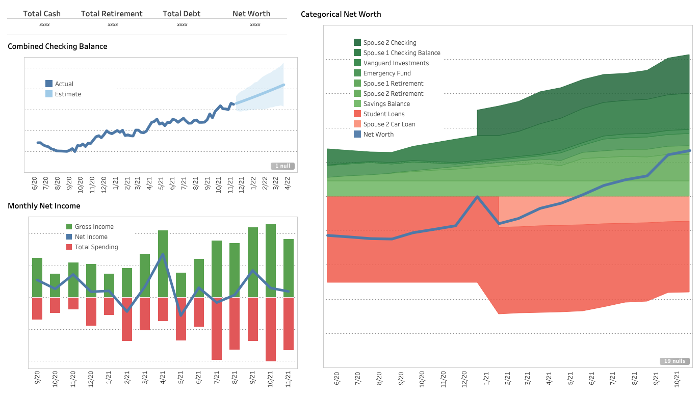
A relational database consisting of nine financial accounts (e.g. checking accounts, savings, loans) was created and queried using pgAdmin4 to create a Tableau dashboard that tracks income, spending, and net worth. Some metrics and axes in the dashboard are hidden for general privacy.
Notable Skills Used
SQL - joins, views, window functions, interval functions